PROJECT:
In 2017, I was tasked with writing all new, benefit-focused copy for the core site and product pages of Vivint.com. The project had many stakeholders across the company including brand, online marketing, SEO, and multiple product teams.
The stated purpose of the redesign according to the brief was to upgrade the aesthetics, information architecture, and branding while providing a more clear, concise user experience.
PLANNING:
The project was started by conducting user tests of the current site to observe how people interacted with the current layout. In the feedback, many key issues were identified. Users cited being confused and unsure about how they could find the information they're looking for. In some cases, the users even said they were unable to determine what the product on the page was or how it would help them.
After consulting stakeholders in brand and product, I understood that the new pages needed to be clean with less copy overall. I also decided that the on-page copy would focus on relaying the benefits of each product through plain language.
WRITING:
Working closely with the design and brand teams, we were able to identify a basic template we would use for each product page:
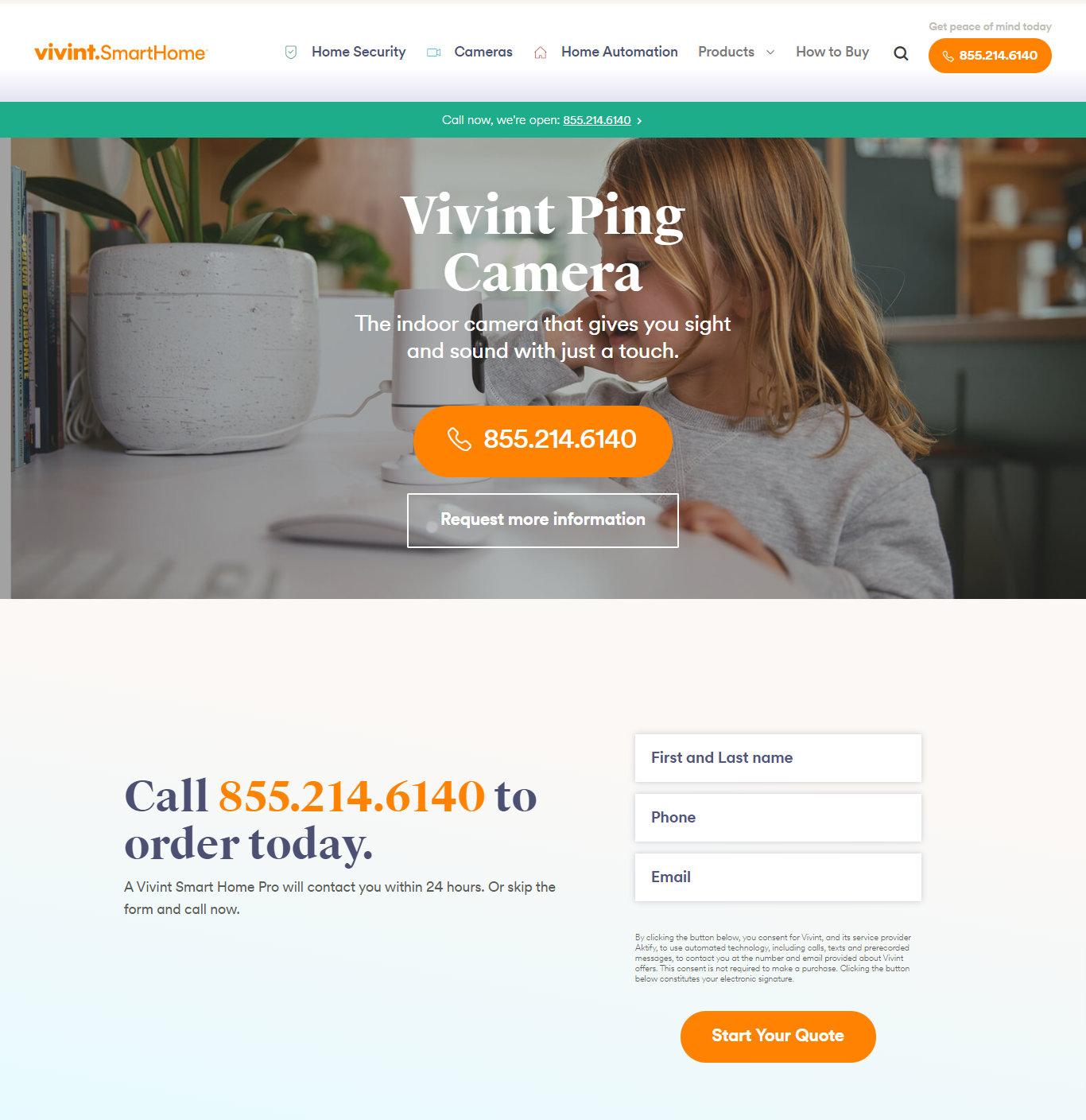
The template would start with the product name, a tagline, and contact and order forms. Presenting those forms above the fold had won out in testing time and time again, and it continued to do so in the redesign.
Next in the template was a section with a short product description, key features, a product image, and specs.
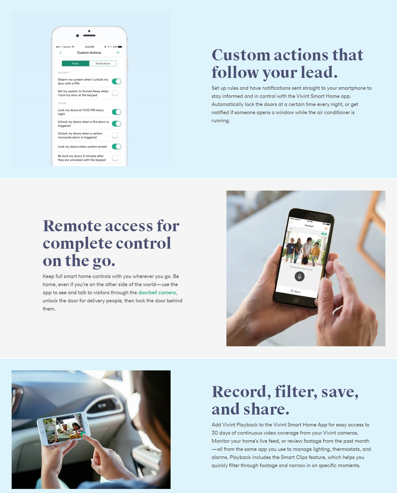
After that, each page would feature benefits, each one with a description on practical applications for the product.
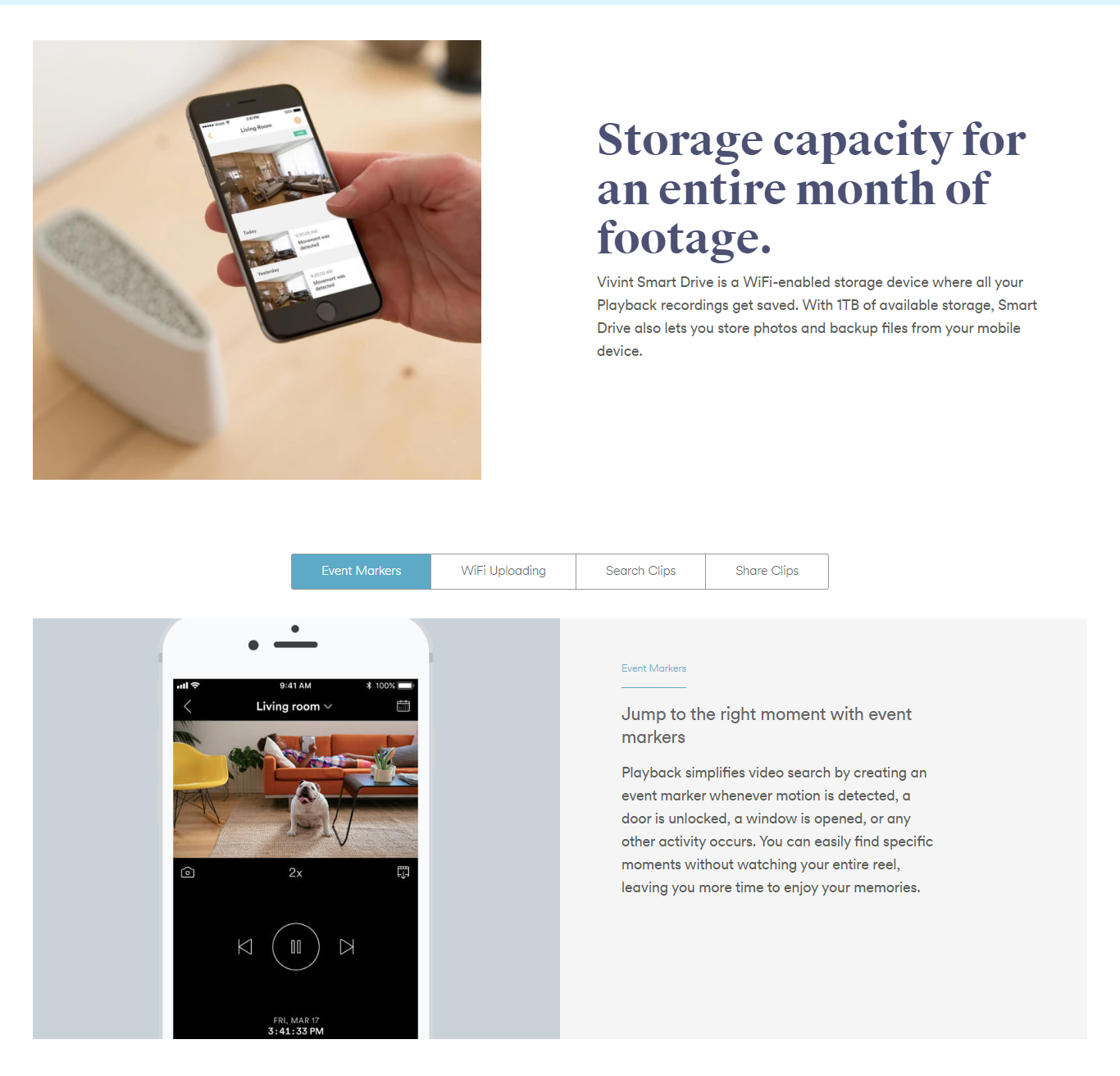
Finally, the template had a carousel of features and more practical applications.
All copy on the page was written and edited by my small team of two writers through a rigorous process involving several drafts and approval by brand, marketing, SEO, and product marketing leadership.
RESULTS:
User testing after launch indicated that we had significantly improved both the clarity and experience on the page. Users were not only able to navigate the page and locate the information they were looking for from one page to the next, they also understand what each product was and how it would be used with other smart home technology. Testing after launch also showed that customers who requested information on a product page had higher intent to buy than customers who filled out the contact form from any other source.
Several full page screenshots from the redesign can be seen below.


